Part Two: is another possible candidate for the Democratic Party, Senator Barack Obama. Barack Obama’s website structure is no different than his counterpart Senator Hillary Clinton. This blog took out all the politics, all their policies, the tears and hair, the compelling stories. Just condense your judgment into the topic of Web Accessibility. I ran an automated scan using AccVerify/Repair® scan of the Barack Obama website (www.barackobama.com). And here are my findings.
Out of 1152 pages, a resounding 0 pages passed automated validation for 3 levels of navigation, based on Section 508. Most of the failure comes from missing alternate description for images in a Mapped Area, which counts to 5,902 images without an Alternative text.
Now for the 10 Checkpoints — I’ll give 1 full point for every passing check point:
1. Use of Color – FAIL
One thing for sure is that the color contrast failed really really bad. Especially in the homepage of Barack’s website.

2. Use of Images -FAIL!
The homepage had some ALT attributes, mostly on the vital information such as his splash banner, and some image links. But most of the failure on his website are in the Image Maps that DO NOT have any alternate text in his blog pages.

3. Flexible Page Design – PASS
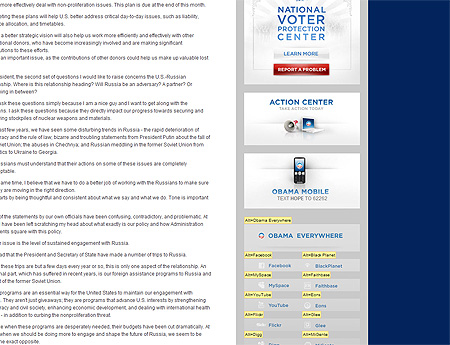
Here’s the website at 800 by 600 resolution. Most of the important information remain such as the Main Navigation. A majority of the users now use 1024 by 768 resolution and higher, which the website works the best.

4. Structure vs. Design – FAIL
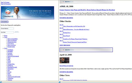
I stripped out the stylesheet and this is what I see: AN UNSTRUCTURED DOCUMENT. There are several broken tags, and unordered headings (some H2s are below H4s, etc.). There are some usage of the Definition Terms and lists on some pages, but without any heading or heading order in that matter, this website fails in Structure vs. Design.

5. Easy, Consistent Navigation – PASS
Bravo to the consistent navigation on top. I also want to note that there are not ONE but TWO Skip Navs on Top one to skip to content and one to skip the many many navigations.
6. Use of Scripts and Forms – FAIL
There are NO LABELS in all of the forms. YIKES! As for the script, the problem I had was when I turned off JavaScript, on the States page, The map disappears and there are NO alternate text along with it.
7. Use of Multimedia – FAIL
Videos on the Media page has NO CLOSED CAPTION, but there’s a Closed Captioning page which has a slew of text that goes to a POPUP of ONE video that has closed captioning. Wow.
8. Use of Frames – PASS
No frames used on this site, but there are some iFrames, which has labels in them.
9. Use of Tables – FAIL
There are tables alright, but they ain’t labeled nor they have any sort of hierarchy.
10. Use of Graphs and Charts – FAIL
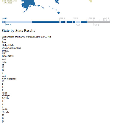
The only chart and graph I find is the Flash widget at the right column of many of the website which links to the Results Center page. A bulk of the contents on this page is in flash, which by the way were not labeled for screen readers, that shows the delegate count against Hillary Clinton. Then, at the bottom, seemingly a data table is NOT a data table, but a list. When I deconstructed it, this is what I see:
No structure whatsoever!
Sen. Barack Obama’s website gets a 3 out of the 10 possible points. Much worse than Sen. Hillary Clinton’s website. There’s a Change, but it’s just worse. This site gets a super “F” for Blacktelephone sites!
Coming up… we are now crossing to the Republican’s candidate, Sen. John McCain…

